Clarifying a nonprofit’s user journey as they added more offerings
PsychArmor, an e-learning non-profit for the military affiliated, reached out needing a fresh look to grow their audience. It was an exciting time as they were growing into new markets and started partnering with companies to provide custom course curriculum. This addition added a few complications.
The company’s brand architecture now needed to encompass two distinct user journeys in a harmonious way
PsychArmor’s brand identity needed to better reflect the aspirational vision the company had for creating a military-connected community with those who have served and civilians.
We jumped in to streamline things, focusing on two key groups: individuals looking to help themselves or a family member, and companies/teams keen on understanding the military community. Our makeover included a fresh logo, branding guide, and updated marketing materials like social graphics, presentations, and flyers. We transformed the website from a video jungle to a smooth user journey tailored for each audience.
Scope:
— Discovery & Strategy
— Logo, Typography & Color
— Website Design
— Course Graphics
— Presentations & Webinars
Role: Designer/Co-Project Manager
Year: 2021
Credit: 2 Designers
Logo Development
PsychArmor’s old logo was outdated and very much catered to service members and government. We reimagined the look to be fresh, modern, and simple to be more timeless. The forward slash was added to represent the partnerships they were striving to create with their custom course curriculum. We also dropped “Institute” because it didn’t feel as inclusive or approachable - opposite of the organization’s mission.
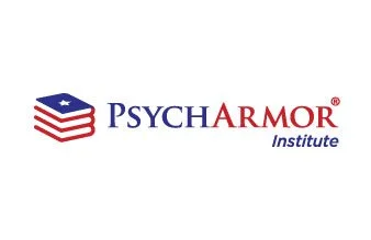
New logo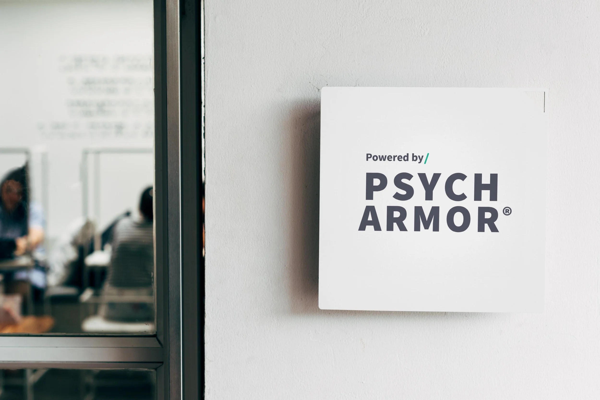
Color Palatte
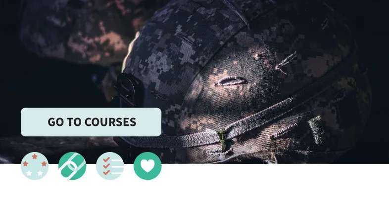
PsychArmor’s old visual identity used the typical red, white, & blue as a military nonprofit. They wanted to be different but still pay homage to the armed forces. What we came up with was a color palatte that was inspired by each branch’s uniform color - Army = green, Air Force = blue, and Marine = tan. The colors give a modern take but they still blend nicely with their military brand photography.
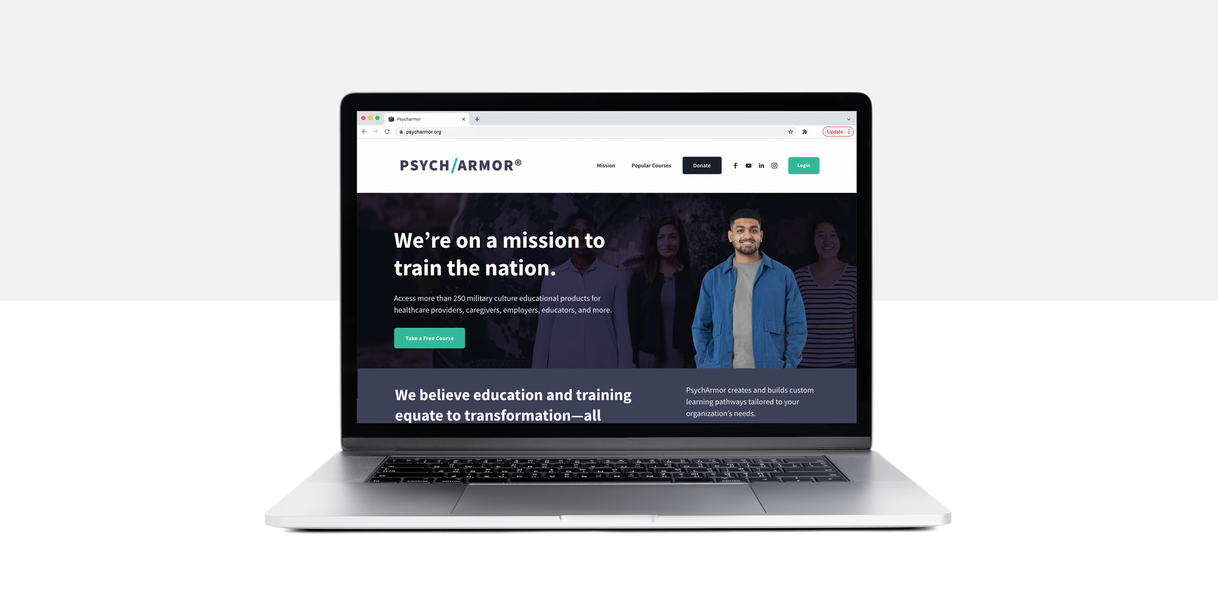
Website Process & Design
After thorough meetings and discussions with the PsychArmor’s team, we understood that they needed to two clear calls to action for two user types.
Persona 1: Individual This person is directly connected to the military - veteran, caregiver, or service member. They want to consume free videos that relate to mental health and transitioning to civilian life.
Persona 2: OrganizationsThis group of key stakeholders want to provide custom content to their community or workforce to better understand veterans and their families. The organization would pick a topic and PsychArmor would provide a subject matter expert to create content. PsychArmor also produces the video series for the organization.
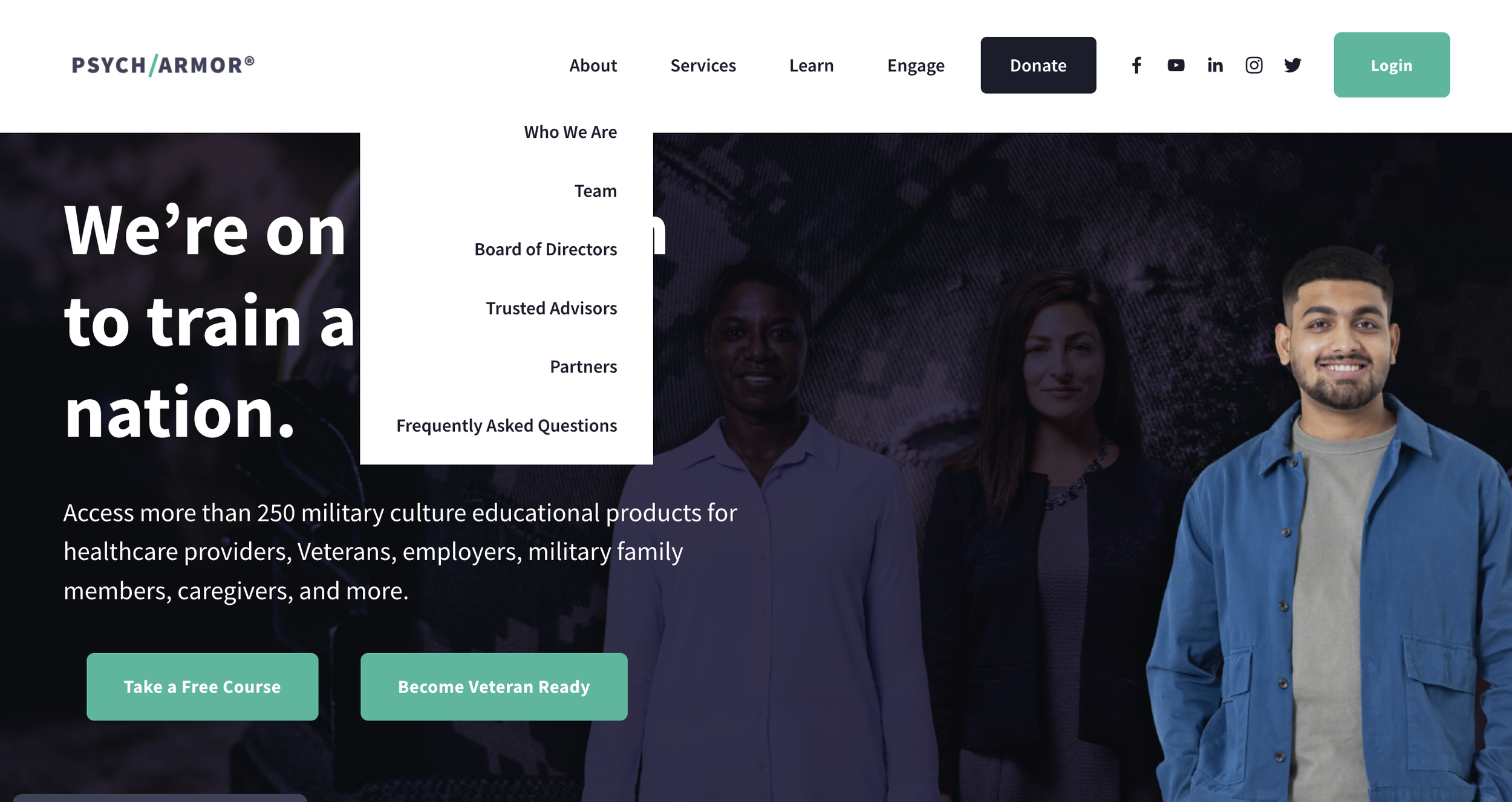
We were creating the user experience on the front-end of the website - prior to them to login to the course curriculum. Beyond the two user journeys, the website also needed to have the necessary content to represent their nonprofit. This includes the mission and visions statements, the board members, and a way to give.